Role
Team
Tools
Adobe Illustrator, Adobe Photoshop, Adobe Lightroom, Canva, DSLR Camera
Timeline
Project Summary
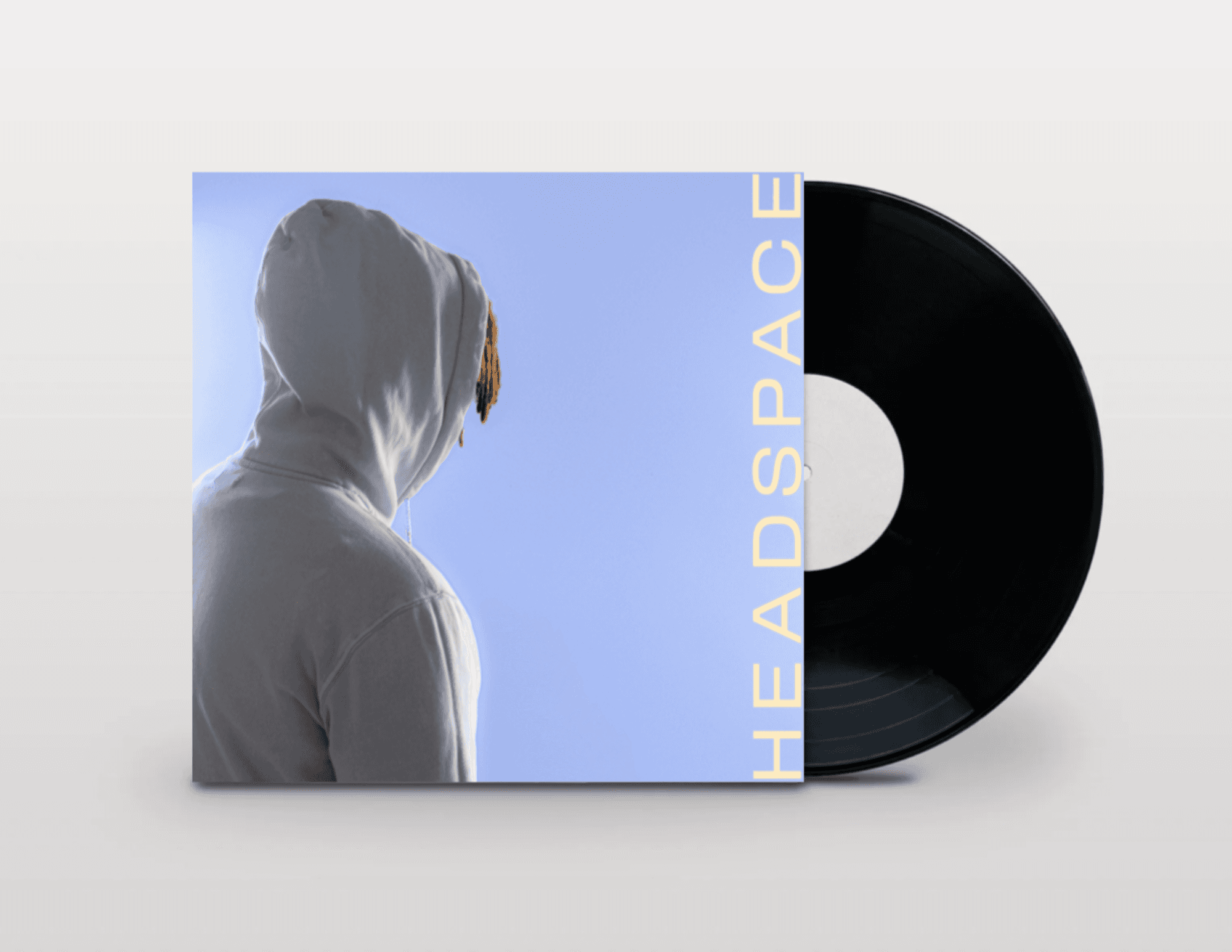
For this project, I designed a complete LP cover, front, back, and spine, for an original album concept called Headspace, shooting and directing all original photography rather than relying on stock imagery. The goal was to translate an abstract, introspective mood into a cohesive physical product: something that could sit on a shelf next to real vinyl and hold its own.
Phase 01
Concept & Direction
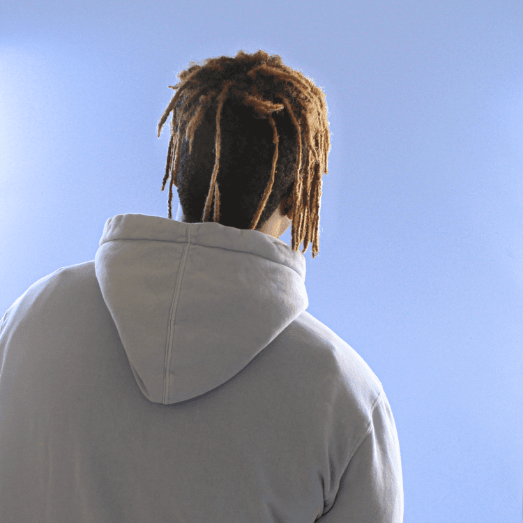
I wanted the cover to feel private and a little uneasy, someone turned away from the viewer, partially obscured, caught mid-thought rather than posing. Album art from artists like Juice WRLD and Powfu informed the tone I was chasing: minimal color, heavy reliance on silhouette and body language, and typography that stays out of the way of the image. I leaned on cool blues and soft, overcast lighting to reinforce the "headspace" idea, a mind that's foggy, closed-off, somewhere else.

Audio Consideration
Though this project centered on the visual design, the album cover was built around a specific sonic identity rather than existing in isolation. The concept called for a lofi, spatial sound, drawing from cloud rap and atmospheric production, genres defined by reverb-heavy vocals, sparse instrumentation, and a sense of space that feels both intimate and distant. I wanted the cover to function the way that music does: quiet, hazy, and a little withdrawn, so every visual choice, from the muted color palette to the subject's turned-away posture, was made to mirror the mood of the genre rather than just illustrate a title. Treating the audio as a design constraint, not just a theme, pushed me to think about album art as translation: turning a feeling you hear into something you can see.
Audio Credit: Prod. Riddiman - Reflejos Perdidos
Phase 02
Process
I served as photographer, art director, and designer for the shoot. Working with natural window light, I directed a series of portraits built entirely around posture and concealment, hood up, face turned, hands covering, to communicate withdrawal without needing a visible expression. I shot dozens of variations to find the exact angle and light balance that read as contemplative rather than staged, then brought the strongest frames into the final layout, building out track listing typography, spine text, and parental advisory placement to match real commercial LP conventions.
Editing & Post Production
The editing process was the most interesting part of this project. I had my concepts, photo direction, and audio consideration in place, but the real question was how Headspace should feel emotionally. I brought the photos into Adobe Lightroom, Photoshop, and Canva Pro, iterating through several directions before landing on a color palette and a deliberately empty, subdued mood that shaped the final look of the album. The contrast between my blonde and black hair and the light blue hoodie ended up reading almost like a filling gauge, with only my head visible, which became the visual seed for the title itself. That emotional quality was exactly what I'd been chasing throughout the edits, and the final result matched the feeling I'd been trying to design toward from the start.
Phase 03
Final Deliverable & Reflection
This project pushed me past designing around photography and into directing it. Every earlier project in this portfolio uses someone else's imagery as a starting point, here, the photography itself was the design decision. I learned how much a subject's posture alone can carry emotional weight, and how restraint (turning away from the camera, hiding the face) can be a stronger storytelling choice than showing more.

Next Steps
Looking back at this project years later, it's clear how much it was shaped by the constraints of a student timeline and a beginner's toolkit. The concept and emotional direction still hold up, but there's a lot I'd push further if I revisited it today with the design skills and resources I have now.

Project Highlights


