Role
Team
Tools
Adobe Illustrator, Adobe Photoshop, Adobe Lightroom, Canva, DSLR Camera
Timeline
Project Summary
One of my favorite projects involved designing a cohesive series of three posters, each representing a different musical icon: Madonna, Ravi Shankar, and Jimi Hendrix. The challenge was to create visually distinct designs that were also conceptually connected in a meaningful way to reflect the unique identities of each artist while establishing a unifying thread. I began by asking myself: what relations could exist between a pop icon, a classical Indian musician, and an African American rock legend? This question led me on a deep research journey into their cultural impact, musical legacies, and visual aesthetics, ultimately informing a unified design approach across the series.
Phase 01
Concept & Direction
My original concept leaned on wordplay to tie the three together creatively, but each artist represents a completely distinct genre and cultural background, so a literal connection felt forced. I hand sketched hundreds of concepts and iterated through them until I landed on a simpler approach: pairing each artist with a single emotion translated into a distinct textured visual element and bold color, unified across all three posters through consistent typography and layout so the series reads as one cohesive exhibition while still letting each artist's identity stand on its own.
Moodboard
This mood board explores the visual language of three iconic musicians. It draws on themes of cultural fusion, rebellion, and spirituality, blending earthy aesthetics with psychedelic rock influences to inform a cohesive poster series that honors each artist’s unique legacy while visually connecting them.

Early Concepts
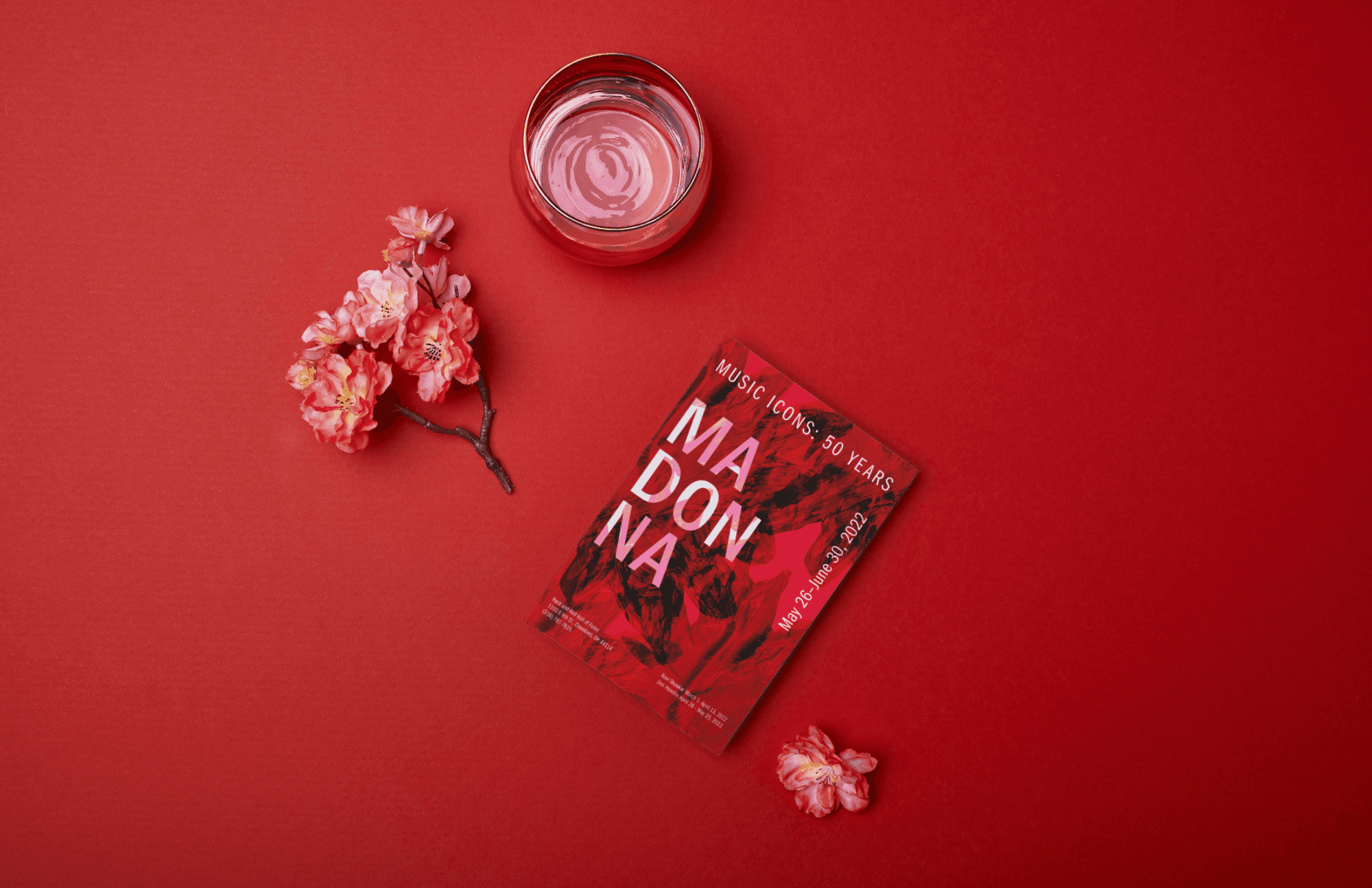
My earliest explorations focused on typography as the primary storytelling device, treating each letterform like a physical object rather than static text. I experimented with dimensional, chiseled type for "MADONNA," slicing the letters apart and reassembling them at sharp angles to suggest movement and reinvention, themes central to her decades-long reinvention of pop identity. Metallic gradients ranging from cool grayscale to warm crimson let me test how much emotional temperature a single color shift could carry, ultimately steering me toward the bolder red-on-red direction that felt more aligned with her provocative, boundary-pushing persona. These early iterations were less about finalizing a look and more about establishing a visual grammar of fractured, dynamic type that I could later adapt across all three artists without losing each one's individual identity.

Phase 02
Typography & Visuals
My typography iteration's explore the visual language of three iconic musicians whose careers, while wildly different in genre and cultural origin, share an underlying spirit of transformation and rule-breaking. It draws on themes of cultural fusion, rebellion, and spirituality, blending earthy, tactile textures with psychedelic rock influences to inform a cohesive poster series that honors each artist's unique legacy while visually connecting them. Rather than relying on literal imagery or portraiture, I built the system around bold, saturated color fields, each carrying a distinct emotional register, paired with dynamic typography that bends and fractures across the composition. This let me create a unified poster series where the shared "Music Icons: 50 Years" branding and typographic system tie all three together, while the individual colors and textures let Madonna's boldness, Ravi Shankar's cultural depth, and Jimi Hendrix's psychedelic energy each come through clearly.


Painting
I used physical paint to create a distinct visual identity for each artist, letting the texture and emotion of each color carry meaning beyond the typography alone. Madonna is often referred to as the "woman on fire," so I created bold paint splotches evoking flame, using that imagery to represent power and growth rather than rage or destruction. For Jimi Hendrix, I worked with black paint in sharp, spiked splotches to capture his raw rockstar energy, layered with jagged purple accents symbolizing his strength and unifying influence on the genre. Ravi Shankar felt like the most nuanced challenge; his music is grounded and deeply instrumental, so I developed a rough, earthy green texture meant to reflect his groundedness and his ability to connect and unify audiences across cultures through his sound. Working with paint alongside digital design was an unexpectedly powerful combination, and seeing how a physical, tactile medium could elevate a digital composition made this one of the most rewarding projects I've worked on.
Editing
With the final typographic styling and paint textures in place, I brought both assets into Photoshop, spending countless hours layering filters and manipulating the paint to blend seamlessly into each poster. Each artist's name sits front and center as the visual anchor, with the remaining type, including event details and dates, arranged around it to support the composition without competing with the central focus.
Phase 03
Final Deliverable & Reflection
This project pushed me past designing around photography and into directing it. Every earlier project in this portfolio uses someone else's imagery as a starting point, here, the photography itself was the design decision. I learned how much a subject's posture alone can carry emotional weight, and how restraint (turning away from the camera, hiding the face) can be a stronger storytelling choice than showing more.