
Role
Team
Tools
Adobe Creative Cloud, Canva, Figma, HTML/CSS
Timeline
Project Summary
For this collaborative project, our team undertook a complete redesign of The Cheesecake Factory's website, with a primary focus on improving accessibility and overall usability. We restructured the navigation and page layouts to reduce friction across key user flows, particularly reservations and ordering, while ensuring the design met ADA compliance standards for contrast, focus states, and screen reader support. Responsive design was built in from the start, ensuring a consistent, accessible experience across desktop, tablet, and mobile. The result is a cleaner, more modern interface that makes the site easier to navigate for all users, while still highlighting the brand's products and personality.
Phase 01
Problem
The original Cheesecake Factory website presented significant usability and accessibility barriers for everyday tasks like making a reservation or browsing the menu. Navigation was cluttered, information was buried across inconsistent page layouts, and the site fell short of ADA compliance standards in areas like color contrast, focus states, and screen reader support. Our goal was to identify these pain points through research and rebuild the experience around clarity, accessibility, and ease of use.
Benchmarking Insights
We looked at how comparable restaurant and hospitality sites handled reservations, navigation, and accessibility to identify best practices worth adapting. This research, combined with our own usability findings, helped us pinpoint where the existing site's information architecture and interaction patterns were falling short, and gave us a clearer target for what a genuinely accessible, user-friendly redesign should look like.

ADA Compliance
This project treated ADA compliance not as a checklist to satisfy after the fact, but as a core design constraint from the very first phase. Every decision, from color contrast ratios and focus states to simplified navigation and reduced cognitive load, was made with the goal of ensuring the site could be used by people of all abilities, not just the average user. Designing for accessibility ultimately makes a product better for everyone: clearer hierarchy, simpler flows, and more legible content benefit every user, disabled or not, which is why we saw it as inseparable from the redesign's overall success rather than a separate requirement layered on top.
Phase 02
In Class Early Feedback
During our early concept pitch, feedback from classmates and our instructor pushed us to think more specifically about who we were actually designing for, rather than treating "the user" as one general audience. This feedback directly shaped our decision to build two distinct personas rather than one: Joyanna, a young designer managing ADHD and information overload, and Sandy, a busy parent navigating the site under time pressure and distraction. Splitting the user base this way forced us to design for divergent needs, simplicity for one, speed and efficiency for the other, rather than optimizing for a single "typical" user who doesn't really exist.
Personas
To ground the redesign in real user needs, we built personas representing the range of people who rely on the Cheesecake Factory site for different tasks, from quick solo orders to multi-person reservations under time pressure. Each persona surfaced a distinct set of pain points, from cognitive overload and multi-step friction to accessibility barriers, that directly shaped our design priorities moving into the wireframing phase.

Journey Map

Style Guide

Phase 03
Wireframes
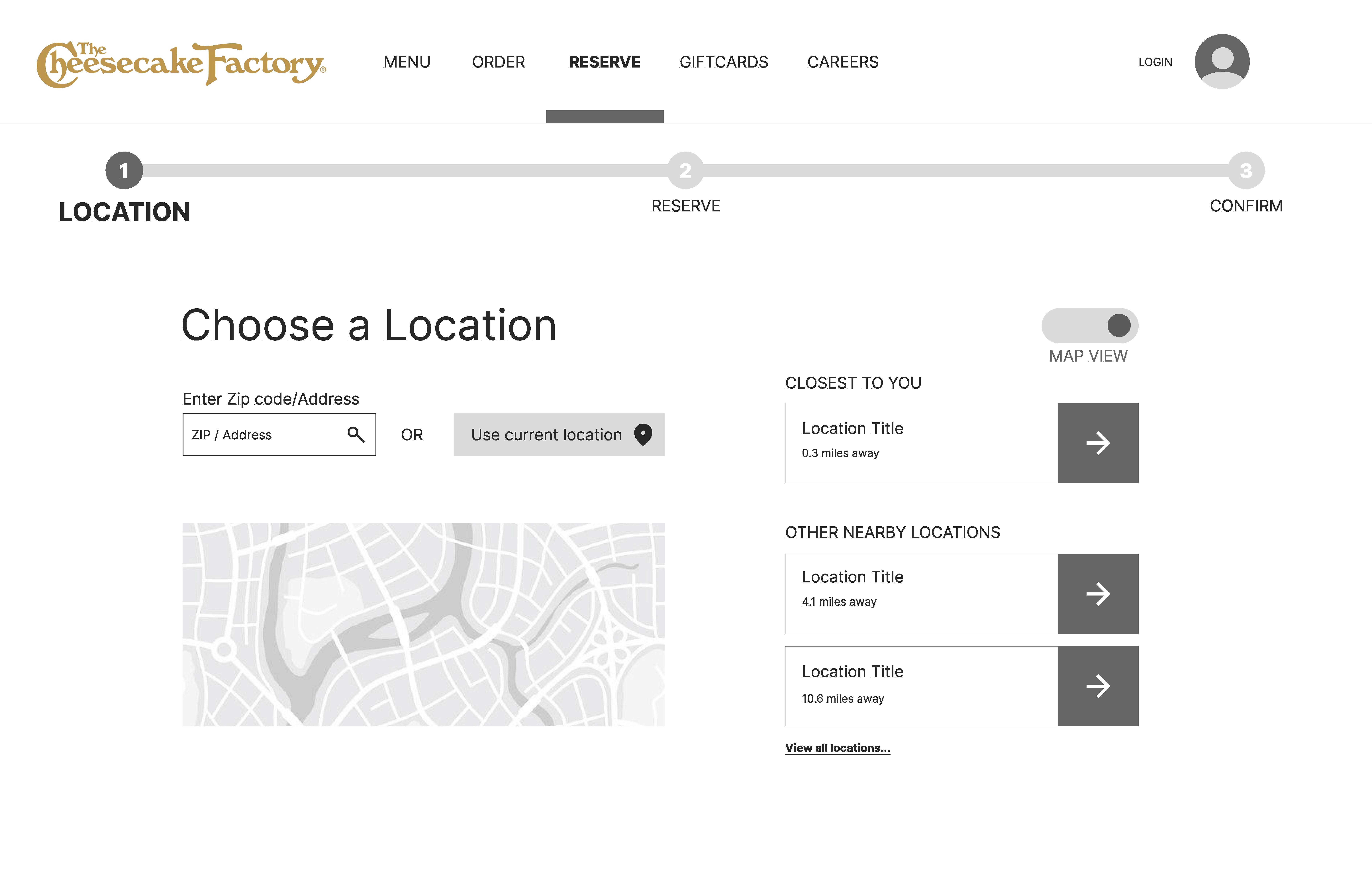
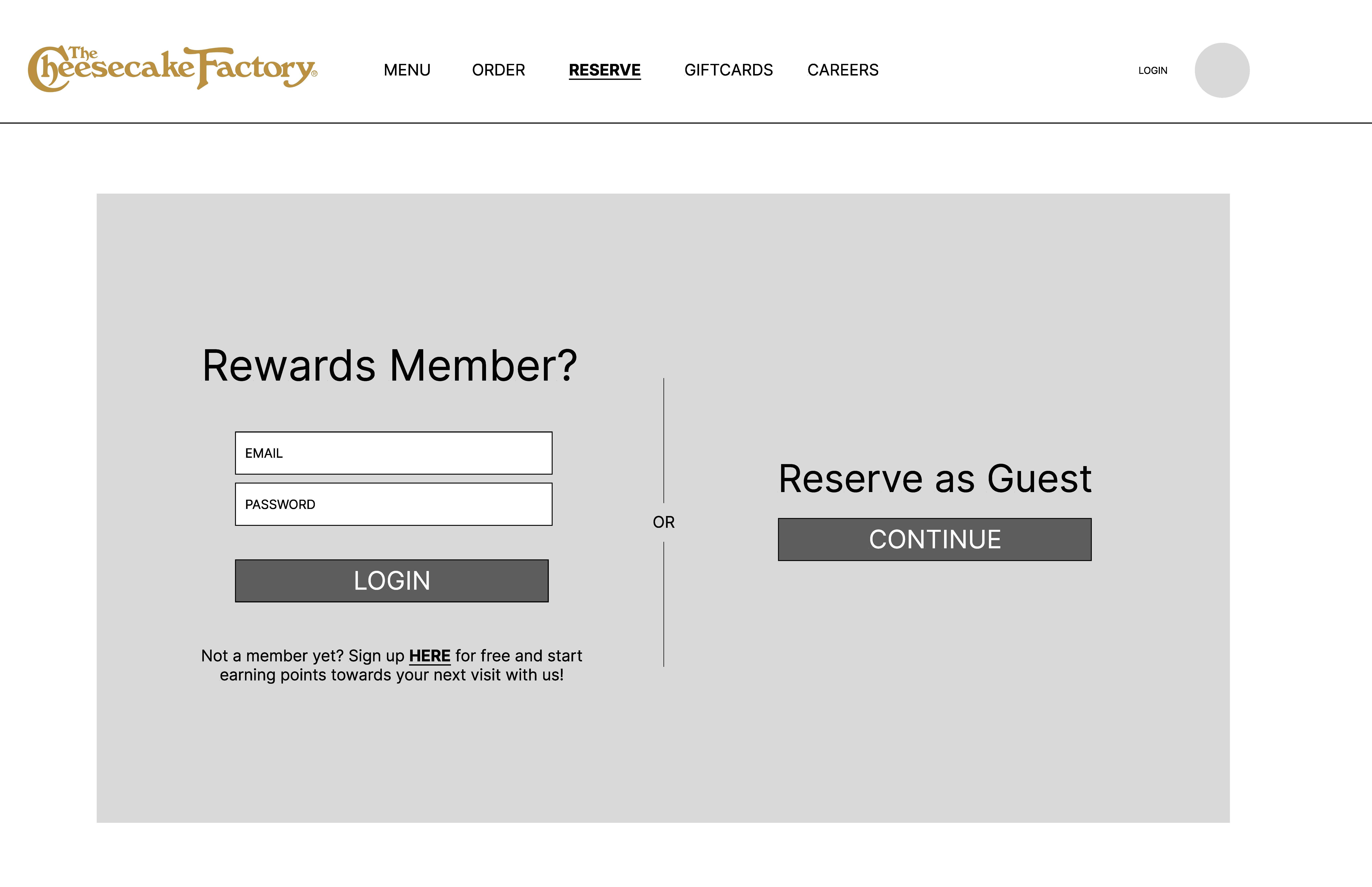
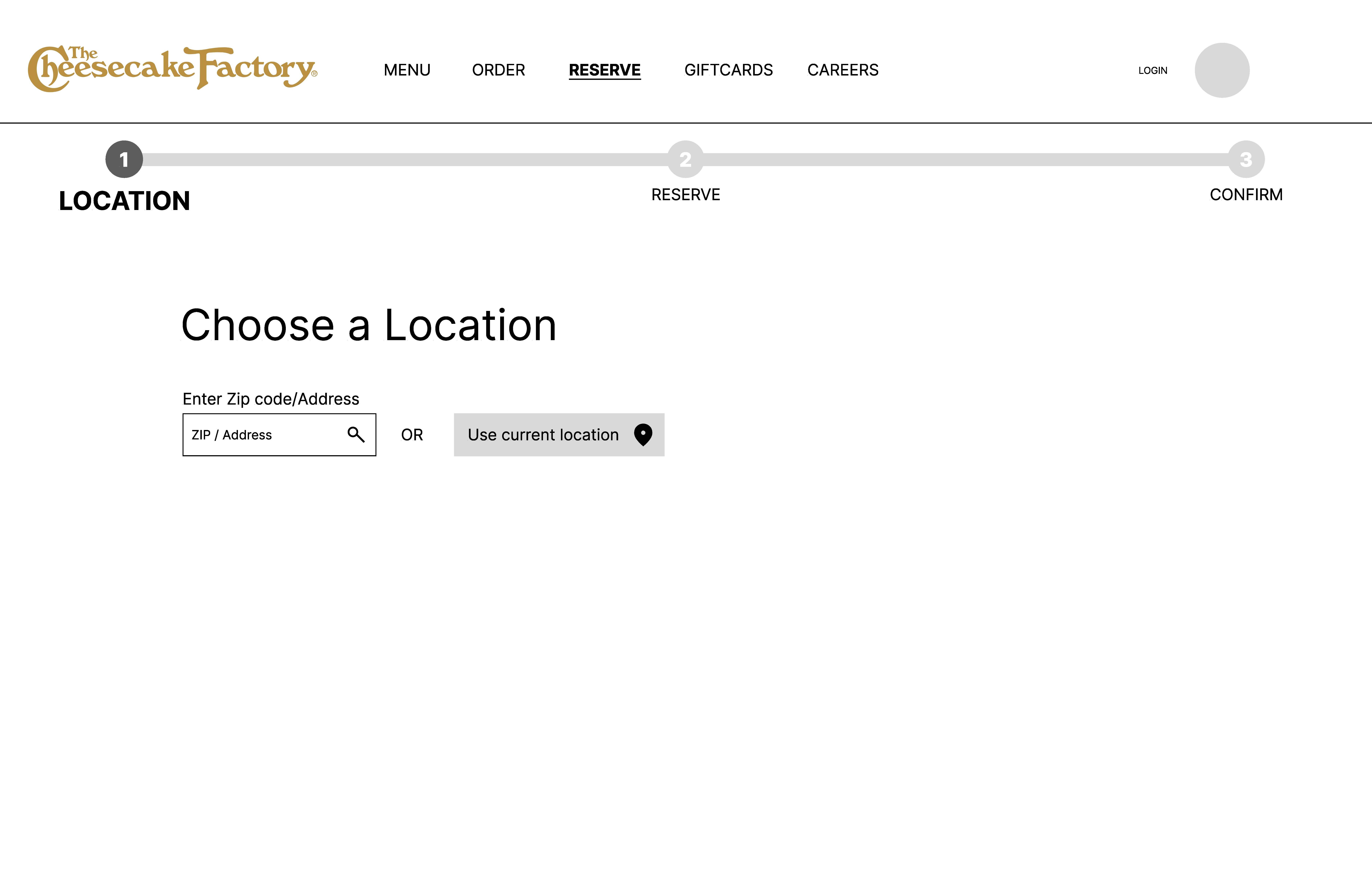
With our research and personas in place, we moved into wireframing, focused on simplifying the reservation and ordering flows into fewer, clearer steps. We paid close attention to establishing a strong visual hierarchy, consistent navigation patterns, and accessible form design, ensuring every screen supported both new users and returning customers without unnecessary friction. We created paper, digital, and stylized with several variations to in-class test with as we got closer to our final redesign.





Phase 03
Final Deliverable & Reflection
By the end of this project, we succeeded in delivering a website redesign that meets ADA compliance standards while significantly improving the overall user experience for both accessibility-focused and everyday users. Our primary challenge was balancing ambition with scope. With more time, there's a lot more functionality we could have built into the site beyond core ordering and reservations, but we intentionally kept the experience focused rather than layering in additional features that risked overwhelming users, whether they were relying on assistive technology or simply browsing the site casually. That restraint was itself a deliberate design decision, prioritizing clarity and usability over feature breadth, and it's a tradeoff we'd continue to revisit if we expanded this project further.
Next Steps
This redesign was one of our most in-depth UX projects, and there's still meaningful work we'd want to pursue if we continued developing it further.
